
Queen V Font
2020
Creating a typeface from the ground up means that it is applicable to a broad audience. Rather than creating for a specific client, the purpose of this typeface is to fill a need or aesthetic interest in the font community that can be expanded upon. The process for creating this font starts with sketching and planning on paper before going digital in Adobe Illustrator. Characters can be taken from Illustrator into a separate app like Glyphs or Fontself to space the letters correctly so that when used, the kerning appears uniform. Two of the aesthetic influences for the typeface Queen V are the general style rules of Modern fonts and the look of some fonts and fashion styles from the Victorian Era in England.
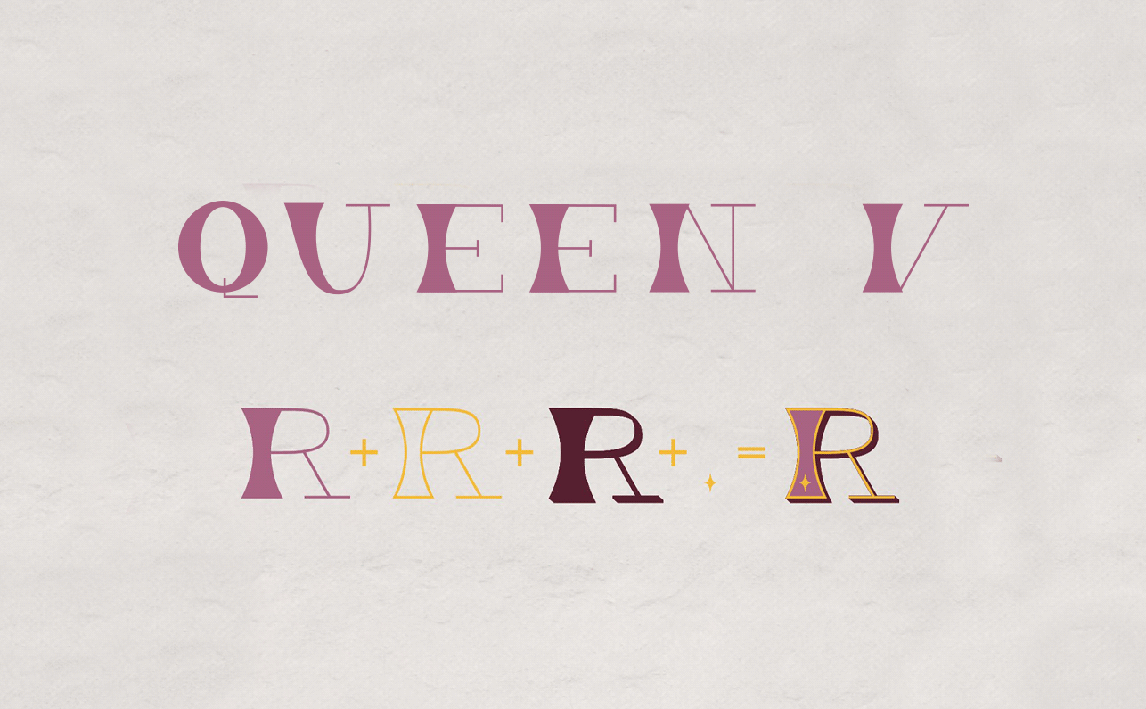
Queen V has some influence from some Victorian typefaces from the 1800s and fonts since stylized with the Victorian era in mind with modern contexts. The font has a very high contrast in line weight. All of the left stems of letters in the font are weighted with a thick stem that allows for white space inside or the heaviest part of the letter mass. Queen V cannot be realistically used as a display font because of its difficult readability if viewed in a large paragraph of text but its ability to successfully communicate as a headline.
Like traditional modern fonts, Queen V has no bracketing on many of its serifs, instead opting for flat thin serifs. It breaks the mold of modern type by including a mix of two serif styles within a single typeface to allow for the stylized hourglass shape of the thick strokes. Rather than weight contrast being from thick vertical strokes and thin horizontal strokes as is more common, Queen V uses only one vertical leg or ascender in each letter to be thick while all other lines are uniformly thin.
Because some of the parts of the typeface are thin and could get lost in background imagery, having a shadow layer behind the base font is a necessary way of making the font applicable for more applications. Though there are repeated elements in the three bottom layers of the typeface, it makes it very easy to use the layers as separate fonts that stand well on their own as well as in tangent with the other layers. The placement of the star accents is uniform when placed high, low, or in the middle of letters for the most part but this is the most non-uniform aspect of the typeface. The goal of the accents is to look a little random spaced throughout words to mimic stars spaced in the sky.


